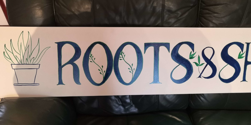
Roots & Shoots
Nov. 24th, 2022 11:14 amSo, thanks to ![[personal profile]](https://www.dreamwidth.org/img/silk/identity/user.png) ysabetwordsmith, I've decided to upload all of my signwriting projects here so I'll have a record of them.
ysabetwordsmith, I've decided to upload all of my signwriting projects here so I'll have a record of them.
This one was the project from Roman script week. The brief was to make a shop sign for a shop called Roots & Shoots, using Roman lettering.
The instructor made a demonstration piece, which was 1.5 metres long by 30 cm high. We weren't supposed to copy his design, but I figured I could use the same dimensions.
I had ordered a roll of paper for drafting patterns from the internet, and it looked larger than it turned out to be. It turned out to be only 22cm high. But I figured I could still use it for this - I was like 'Well, we need space around the edges anyway, this'll be fine.' So I cut myself a 1.6 metre long length of this and drafted a pattern.
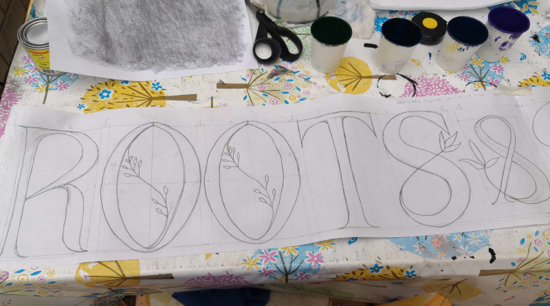
I divided 1.5 metres by 12 (number of letters) to figure out how wide each letter should be. Forgot to add extra for spaces around the '&' and obviously assumed that I was using the full height of the paper. So my letters are maybe taller and thinner than they should be.
At any rate, when I had finished the plan I decided that when it came to transferring the plan onto the board, I would cut around the '&' and space the words out a bit more.
Then I had to wait several weeks while I tried to find somewhere that would sell me a single piece of aluminium dibond for less than £48. I did not find anywhere, so in the end I went to the local hardware stall and bought a piece of shelving instead. Texture - slightly dimpled all over, rather than the smoothness of the dibond.
The shelving only came in 2 metre long lengths. I was like 'hurray! Finally I can get to this!' So I transferred the pattern over - and totally forgot that I had meant to add extra spaces. Instead, I added some pot plants at either end :)
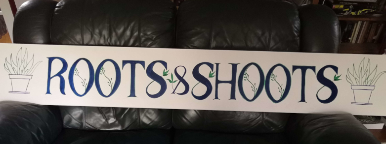
What have we learned from this? More concentration on spacing required. Also, don't be afraid to make your letters shorter if they cannot be wide, so that they maintain better proportions.
But also - this is not bad work for someone who has been doing this for not-quite four months. I think I am now at the stage where I *could* paint the name on my son's narrowboat and it wouldn't look completely amateurish.
Motto for this week - everything is better with a pot plant.

This one was the project from Roman script week. The brief was to make a shop sign for a shop called Roots & Shoots, using Roman lettering.
The instructor made a demonstration piece, which was 1.5 metres long by 30 cm high. We weren't supposed to copy his design, but I figured I could use the same dimensions.
I had ordered a roll of paper for drafting patterns from the internet, and it looked larger than it turned out to be. It turned out to be only 22cm high. But I figured I could still use it for this - I was like 'Well, we need space around the edges anyway, this'll be fine.' So I cut myself a 1.6 metre long length of this and drafted a pattern.

I divided 1.5 metres by 12 (number of letters) to figure out how wide each letter should be. Forgot to add extra for spaces around the '&' and obviously assumed that I was using the full height of the paper. So my letters are maybe taller and thinner than they should be.
At any rate, when I had finished the plan I decided that when it came to transferring the plan onto the board, I would cut around the '&' and space the words out a bit more.
Then I had to wait several weeks while I tried to find somewhere that would sell me a single piece of aluminium dibond for less than £48. I did not find anywhere, so in the end I went to the local hardware stall and bought a piece of shelving instead. Texture - slightly dimpled all over, rather than the smoothness of the dibond.
The shelving only came in 2 metre long lengths. I was like 'hurray! Finally I can get to this!' So I transferred the pattern over - and totally forgot that I had meant to add extra spaces. Instead, I added some pot plants at either end :)

What have we learned from this? More concentration on spacing required. Also, don't be afraid to make your letters shorter if they cannot be wide, so that they maintain better proportions.
But also - this is not bad work for someone who has been doing this for not-quite four months. I think I am now at the stage where I *could* paint the name on my son's narrowboat and it wouldn't look completely amateurish.
Motto for this week - everything is better with a pot plant.
