So, thanks to ![[personal profile]](https://www.dreamwidth.org/img/silk/identity/user.png) ysabetwordsmith, I've decided to upload all of my signwriting projects here so I'll have a record of them.
ysabetwordsmith, I've decided to upload all of my signwriting projects here so I'll have a record of them.
This one was the project from Roman script week. The brief was to make a shop sign for a shop called Roots & Shoots, using Roman lettering.
The instructor made a demonstration piece, which was 1.5 metres long by 30 cm high. We weren't supposed to copy his design, but I figured I could use the same dimensions.
I had ordered a roll of paper for drafting patterns from the internet, and it looked larger than it turned out to be. It turned out to be only 22cm high. But I figured I could still use it for this - I was like 'Well, we need space around the edges anyway, this'll be fine.' So I cut myself a 1.6 metre long length of this and drafted a pattern.
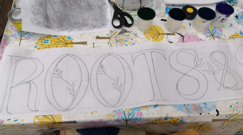
I divided 1.5 metres by 12 (number of letters) to figure out how wide each letter should be. Forgot to add extra for spaces around the '&' and obviously assumed that I was using the full height of the paper. So my letters are maybe taller and thinner than they should be.
At any rate, when I had finished the plan I decided that when it came to transferring the plan onto the board, I would cut around the '&' and space the words out a bit more.
Then I had to wait several weeks while I tried to find somewhere that would sell me a single piece of aluminium dibond for less than £48. I did not find anywhere, so in the end I went to the local hardware stall and bought a piece of shelving instead. Texture - slightly dimpled all over, rather than the smoothness of the dibond.
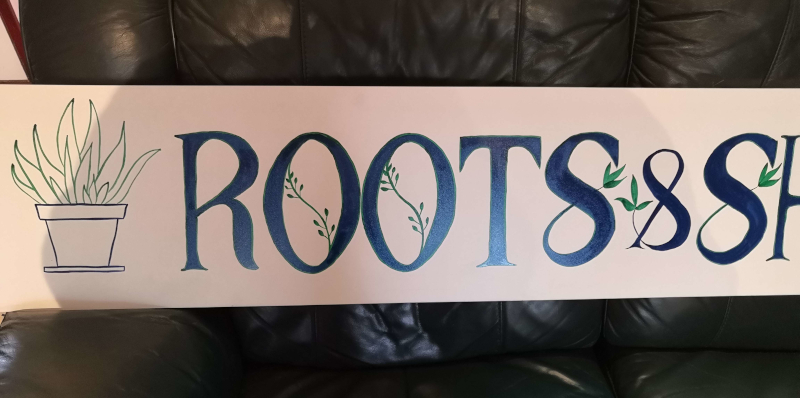
The shelving only came in 2 metre long lengths. I was like 'hurray! Finally I can get to this!' So I transferred the pattern over - and totally forgot that I had meant to add extra spaces. Instead, I added some pot plants at either end :)
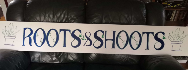
What have we learned from this? More concentration on spacing required. Also, don't be afraid to make your letters shorter if they cannot be wide, so that they maintain better proportions.
But also - this is not bad work for someone who has been doing this for not-quite four months. I think I am now at the stage where I *could* paint the name on my son's narrowboat and it wouldn't look completely amateurish.
Motto for this week - everything is better with a pot plant.
This one was the project from Roman script week. The brief was to make a shop sign for a shop called Roots & Shoots, using Roman lettering.
The instructor made a demonstration piece, which was 1.5 metres long by 30 cm high. We weren't supposed to copy his design, but I figured I could use the same dimensions.
I had ordered a roll of paper for drafting patterns from the internet, and it looked larger than it turned out to be. It turned out to be only 22cm high. But I figured I could still use it for this - I was like 'Well, we need space around the edges anyway, this'll be fine.' So I cut myself a 1.6 metre long length of this and drafted a pattern.

I divided 1.5 metres by 12 (number of letters) to figure out how wide each letter should be. Forgot to add extra for spaces around the '&' and obviously assumed that I was using the full height of the paper. So my letters are maybe taller and thinner than they should be.
At any rate, when I had finished the plan I decided that when it came to transferring the plan onto the board, I would cut around the '&' and space the words out a bit more.
Then I had to wait several weeks while I tried to find somewhere that would sell me a single piece of aluminium dibond for less than £48. I did not find anywhere, so in the end I went to the local hardware stall and bought a piece of shelving instead. Texture - slightly dimpled all over, rather than the smoothness of the dibond.
The shelving only came in 2 metre long lengths. I was like 'hurray! Finally I can get to this!' So I transferred the pattern over - and totally forgot that I had meant to add extra spaces. Instead, I added some pot plants at either end :)

What have we learned from this? More concentration on spacing required. Also, don't be afraid to make your letters shorter if they cannot be wide, so that they maintain better proportions.
But also - this is not bad work for someone who has been doing this for not-quite four months. I think I am now at the stage where I *could* paint the name on my son's narrowboat and it wouldn't look completely amateurish.
Motto for this week - everything is better with a pot plant.

no subject
Date: 2022-11-24 03:14 pm (UTC)From:no subject
Date: 2022-11-24 07:49 pm (UTC)From:no subject
Date: 2022-11-24 04:00 pm (UTC)From:no subject
Date: 2022-11-24 07:51 pm (UTC)From:no subject
Date: 2022-11-24 07:59 pm (UTC)From:no subject
Date: 2022-11-25 09:29 am (UTC)From:no subject
Date: 2022-11-24 04:07 pm (UTC)From:no subject
Date: 2022-11-24 07:52 pm (UTC)From:Thoughts
Date: 2022-11-24 10:55 pm (UTC)From:Yay! :D I'm so happy you found that useful.
>>I had ordered a roll of paper for drafting patterns from the internet, and it looked larger than it turned out to be. It turned out to be only 22cm high. <<
I bought a roll of butcher paper for making patterns and other crafts. It is quite large, though sometimes I do have to splice it for wider patterns. This is much less work than splicing 8 1/2" x 11" pages, or paper bags.
For future reference, if buying something online that includes measurements, use a meter stick or tape measure to show you the real-life size. I do this a lot, unless it's a standard size I already know.
>>So I cut myself a 1.6 metre long length of this and drafted a pattern.<<
I love seeing pictures of things in progress. :D Also, the little guide lines give me a sense of nostalgia for historic calligraphy. Some old manuscripts still have faint trace lines or prick marks visible.
>>I divided 1.5 metres by 12 (number of letters) to figure out how wide each letter should be. Forgot to add extra for spaces around the '&' and obviously assumed that I was using the full height of the paper. So my letters are maybe taller and thinner than they should be.<<
Spacing in calligraphy is like seam allowance in sewing: critical, but easy to forget. Practice makes ... a lower mistake rate. I still use red pins on the triangles in patterns so I'm less likely to cut the fool things off. Some folks color those parts red for the same reason.
>>Then I had to wait several weeks while I tried to find somewhere that would sell me a single piece of aluminium dibond for less than £48. I did not find anywhere, so in the end I went to the local hardware stall and bought a piece of shelving instead. Texture - slightly dimpled all over, rather than the smoothness of the dibond.<<
Try talking to places that sell supplies and see if they have scraps. That won't work for every project, but is a useful way to get materials free or cheap. When you're cutting big slabs or long lengths of things, you frequently wind up with odd-shaped bits. For a while here, our lumberyard put them in a bin out front for people to take free. The home-improvement and plumbing places have buckets of scraps for cheap.
Alternatively, if you use the same materials repeatedly, consider buying a big piece that you can cut down or have cut down for multiple projects. We've done that with PVC pipes for drum making workshops. If we only need one piece, the scrap bin will likely have something usable; but if we need six, we buy a pipe.
>>So I transferred the pattern over - and totally forgot that I had meant to add extra spaces.<<
Forgetting steps or plans is a known failure mode in lengthy projects. Keeping a set of project notes -- especially for an assignment -- can reduce the frequency of this problem. Sometimes I remember to do that. But I confess that I have a months-long project where I'm not actually sure what should be my next step. *headdesk* And that was after taking notes on some parts.
>>Instead, I added some pot plants at either end :)
I really like the pot plants! :D When I am making title strips for scrapbooking, I often include bracketing art like that.
>>What have we learned from this? More concentration on spacing required. Also, don't be afraid to make your letters shorter if they cannot be wide, so that they maintain better proportions.<<
If you're learning, it's worthwhile. \o/
>>But also - this is not bad work for someone who has been doing this for not-quite four months. I think I am now at the stage where I *could* paint the name on my son's narrowboat and it wouldn't look completely amateurish.<<
I agree. The sign is very pretty and looks very much like signs I have seen on plant stores.
It looks much better than the temp signs for "Fresh Eggs" or any other variable product for sale by our Amish neighbors. The permanent signs are all nicely cut by the local signmaker, but the temp ones are almost all scribbled or painted on a board or cardboard.
>> Motto for this week - everything is better with a pot plant.<<
Good motto. :D
no subject
Date: 2022-11-24 11:57 pm (UTC)From:That's lovely!
no subject
Date: 2022-11-25 04:50 am (UTC)From:And agreed - potted plants improve many things! They're so cute!
no subject
Date: 2022-11-25 11:13 am (UTC)From: