galadhir: a blue octopus sits in a golden armchair reading a black backed novel (Default)
So, our morris side Sutton Masque has a green and gold colourscheme, from the tatters on our jackets to our facepaint. But we also are not made of money, so when I found a second hand drum in a charity shop, I bought it for the musicians even though it was bright blue.

We covered the entire thing with a large square of green fleece, tied on with gold elastic, and that was great.

Unfortunately, after five years of continual wear, the green fleece developed holes, especially where it was caught between the drum stick and the rim while people were drumming. It was time for something to be done.

Enter DH, who said to me, "You have signwriting training now. We could paint the drum in side colours and then you could write the name on it."

Exciting! This would be my second ever public-facing project, and the first one that had actually mattered. After all, no one really cares what my bins look like, but Sutton Masque are going to be carrying this drum around with us for at least another five years. It needed to look okay.

So, I started by taking the drum skin and supports off the blue drum


and then giving it four coats of quick drying spray paint in dark green


Then with much trepidation I painted 'Sutton Masque' on it in metallic gold enamel paint. Or rather, I painted
SUT TON
MAS QUE

because I wanted to have the name cover the entire visible surface from the front, and that consists of the front two panels - so one of the drum struts goes right up the middle, and I had to leave room for it.

The font is 'God of War' from dafont.com which we also use on our t-shirts.


Time for the second coat (this time in direct light so it looks an entirely different green. It isn't!)


Then I put all the drum furniture and the skin back on again. And now we don't need to hide it under a cloth :)


I am much happier about this than I have been about anything since the bins! And I'll find out how the rest of the side feel about it on Wednesday (practice night.)
galadhir: a blue octopus sits in a golden armchair reading a black backed novel (Default)
So, thanks to [personal profile] ysabetwordsmith, I've decided to upload all of my signwriting projects here so I'll have a record of them.

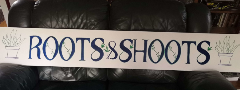
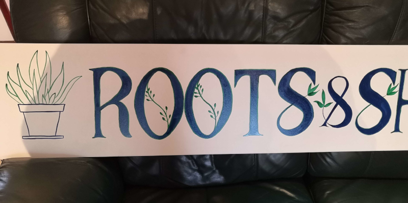
This one was the project from Roman script week. The brief was to make a shop sign for a shop called Roots & Shoots, using Roman lettering.

The instructor made a demonstration piece, which was 1.5 metres long by 30 cm high. We weren't supposed to copy his design, but I figured I could use the same dimensions.

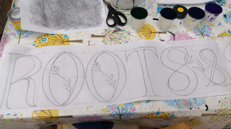
I had ordered a roll of paper for drafting patterns from the internet, and it looked larger than it turned out to be. It turned out to be only 22cm high. But I figured I could still use it for this - I was like 'Well, we need space around the edges anyway, this'll be fine.' So I cut myself a 1.6 metre long length of this and drafted a pattern.


I divided 1.5 metres by 12 (number of letters) to figure out how wide each letter should be. Forgot to add extra for spaces around the '&' and obviously assumed that I was using the full height of the paper. So my letters are maybe taller and thinner than they should be.

At any rate, when I had finished the plan I decided that when it came to transferring the plan onto the board, I would cut around the '&' and space the words out a bit more.

Then I had to wait several weeks while I tried to find somewhere that would sell me a single piece of aluminium dibond for less than £48. I did not find anywhere, so in the end I went to the local hardware stall and bought a piece of shelving instead. Texture - slightly dimpled all over, rather than the smoothness of the dibond.

The shelving only came in 2 metre long lengths. I was like 'hurray! Finally I can get to this!' So I transferred the pattern over - and totally forgot that I had meant to add extra spaces. Instead, I added some pot plants at either end :)


What have we learned from this? More concentration on spacing required. Also, don't be afraid to make your letters shorter if they cannot be wide, so that they maintain better proportions.

But also - this is not bad work for someone who has been doing this for not-quite four months. I think I am now at the stage where I *could* paint the name on my son's narrowboat and it wouldn't look completely amateurish.

Motto for this week - everything is better with a pot plant.

galadhir: a blue octopus sits in a golden armchair reading a black backed novel (signwriting)
Painted the seed library box and half painted the 'Roots and Shoots' shop frontage today, and I'm not very satisfied with either of them. Painting something shaped, where the wood grain texture is uneven and the paint coverage is also uneven, is a lot harder than doing the smooth plastic bins. The paint had a tendency to flow along the lines of the wood grain, which meant I kept having to expand the letters to cover all the runs.

Also I mistook the line I'd written to mark where the space went, for the line I'd written to mark where the end of the second 'E' went. Resulting in one E being bigger than the other. I've slightly stretched the first E to try to make it less obvious. But it's not ideal, and the S is just plain ugly.

The script I chose for 'library' is also slightly less than legible. So basically it's a learning experience all around!

The main problem with the shop sign is that I've painted one of the S's wider than all the other letters. I have a plan for rescuing that (which involved painting over it with the background colour.) But the seed library will have to be resigned to being rustic.

Eh, it's only going to go in the local (defunct) post box to be a seed library for the neighbourhood, and the one it's replacing is a plastic tub that used to contain birdseed, so the standards are not high, and it will be good enough for the purpose for which it is intended.

Sigh. I know it's going to take at least a year of practice, and that it's important to practice on lots of different types of things, and that I've learned quite a lot by doing this badly which will lead to me doing it better later, but I want to be good *right now*

Bins

Nov. 13th, 2022 05:18 pm
galadhir: a blue octopus sits in a golden armchair reading a black backed novel (Default)
First piece of public signwriting! Ie first thing I've done that will be released into the wild of the real world, to be seen by members of the public, as opposed to stuff no one but myself (and possibly my social media pals) will see.

My bins!


The white smudges around it are from where I transferred the design onto the bin by writing the number on a piece of paper, rubbing chalk heavily all over the back of the piece of paper to turn it into a kind of tracing paper, and then drawing over the number again. This transfers the design in a thin white line, but it transfers a few smudges too. As soon as the number is dry, I'll wipe the chalk smudges off with a cloth.

This is my mixed recycling bin. I did my green recycling bin too, although by that point I was losing the light and couldn't see my chalked line, which made it difficult. Lesson learned there - don't try to paint in the dark!

Both bins are now lying down in the drive looking like some kind of localized hurricane has passed through. But they'll be dry enough to stand up again in an hour or so.

It is much harder painting something uneven which you have to do while kneeling down than it is to do painting on a piece of paper lying down on a table!

Can I call myself a signwriter yet, or do I have to wait until I've done something for which I've been paid?
galadhir: a blue octopus sits in a golden armchair reading a black backed novel (Default)
So, I started a signwriting course at the very beginning of September this year. It's a year long online course taught by video, with a Facebook group where you can ask questions and a bunch of worksheets that you can print out, in order to paint over them and learn how to control the brush that way.

The guy who teaches it learned his craft with a three year long City and Guilds course, and says that his teachers learned via the traditional apprenticeship that lasted five years. So I feel that having done it for three months, not an awful lot can be expected of me.

Still, I've practiced every day for at least an hour a day since I started, and I think you can see the difference :)

Two signpainting exercises, one done on 8/9/22 and one done on 8/11/22

About two weeks ago I was feeling horribly frustrated and did not want to go on at all because I thought I was rubbish and not improving at all. (Script lettering, ugh, it's the bane of my life.) But looking at these two exercises, I think maybe I am getting somewhere after all.

July 2025

S M T W T F S
  12345
6789101112
1314151617 1819
20212223 242526
2728293031  

Syndicate

RSS Atom

Most Popular Tags

Style Credit

Expand Cut Tags

No cut tags
Page generated Aug. 26th, 2025 02:18 pm
Powered by Dreamwidth Studios